By Theresa Neil
Source: http://designingwebinterfaces.com/designing-web-interfaces-12-screen-patterns
As Bill mentioned in an earlier post, we don’t want to limit this blog to just the principles and patterns found in the book. For that you can check out our Explore the Book section. In the spirit of that, I want to share an additional set of principles and patterns I have been using for RIA design. While the book takes a much more consumer web site orientation, these concepts are central to enterprise application and web productivity application design and more broad than those discussed in the book.
This is the first article in a three part series.

With more companies turning to RIA frameworks for enterprise software development, these screen patterns are indispensable for product managers, UX designers, information architects, interaction designers and developers. The patterns rely heavily upon desktop design principles, subtly blended with many of the better RIA components and principles. I’ve included 100 examples to illustrate these patterns, pulled from desktop, Flex/AIR, Ajax, Laszlo, and Silverlight applications.

Master/Detail screen pattern can be vertical or horizontal. Ideal for creating an efficient user experience by allowing the user to stay in the same screen while navigating between items. Horizontal layout is a good choice when the user needs to see more information in the master list than just a few identifiers- or when the master view is comprised of a set of items that each have additional details.
Click on thumbnail for larger image OR download the PDF.


The Browse screen pattern can be vertical or horizontal. Ideal for creating an custom user experience by allowing the user to start from various entry points for navigating to the item(s) they are interested in.


The Search screen pattern can range from very simple to quite advanced. Ideal for creating an efficient user experience by allowing the user to navigate directly to an item or set of items meeting specific criteria.


The Filter Dataset screen pattern can be vertical or horizontal. Ideal for creating an efficient user experience by allowing the user to refine a set of known data, or further refine search results.


All Form screens should be approached with a solid understanding of usability and design best practices. Refer to “Web Form Design: Filling in the Blanks” by Luke Wroblewski for reference.


The Palette/ Canvas screen pattern is seldom the right pattern to apply, but it is the only pattern for documenting or creating: linear or non-liner processes; flow diagrams; screen layouts; design/diagram with physical size or layout constraints.


A well designed Dashboard will provide: key information at a glance, real time data, easy to read graphics, clear entry points for exploration This is typically not achieved by displaying a single screen of metrics (either in a big table, or just a bunch of graphs). Providing a high degree of customization is no substitute for user research and testing. Stephen Few has a nice book on this topic Information Dashboard Design: The Effective Visual Communication of Data .


The Spreadsheet screen pattern is ideal for creating an efficient user experience by allowing the user to easily scan, edit and enter information (in bulk). The Spreadsheet should provide the following functionality: standard table features like sort, hide/show columns, rearrange columns, group by (if applicable), global level undo/redo, add/insert/delete row, keyboard navigation, import and export.


The Wizard/Quick Start screen pattern is ideal for creating an efficient user experience by guiding the user through a complex or infrequent workflow.


")


The Q&A screen pattern is ideal for creating an efficient user experience by allowing the user to enter known information and receive a solution. Q & A differs from Search in that this pattern should be used to assist users in identifying possible options or a single recommendation in an arena they are lacking expertise (health insurance, mortgages, planning, purchases).


The Parallel Panels screen pattern can be stacked (showing one at a time) or unstacked (showing all at once). This pattern is ideal for organizing chunks of information that are similar or have interdependent tendencies. Efficiency is gained by keeping the user in one screen. Ideal candidates for the stacked variation of this pattern are simple work-flows with: a high level, visible goal that is fed by multiple inputs, multiple non-sequential steps. This combines a number of the web site patterns outlined in “Designing Interfaces” by Jennifer Tidwell for a single pattern for chunking and displaying data.


 The Interactive Model screen pattern is characterized by many interactive elements associated with the key object (a calendar, map, graph, chart, canvas). It is ideal for creating a user experience that is closely aligned with the user’s mental model (a natural fit). Excellent candidates for this pattern are: calendars, maps, gantt charts, what-if scenarios (including calculators), WYSIWYG editors (including photo editing).


This is the natural state of the application, before any data has been entered or accessed. The book, “Getting Real” by 37signals”explains that a blank state screen is an excellent place to set users expectations. By giving them a preview this can lower anxiety and reduce frustration and confusion. Items to include in a blank state screen include: videos, quick tutorials, help tips, a screenshot of what a fully loaded screen will look like.


Source: http://designingwebinterfaces.com/designing-web-interfaces-12-screen-patterns
As Bill mentioned in an earlier post, we don’t want to limit this blog to just the principles and patterns found in the book. For that you can check out our Explore the Book section. In the spirit of that, I want to share an additional set of principles and patterns I have been using for RIA design. While the book takes a much more consumer web site orientation, these concepts are central to enterprise application and web productivity application design and more broad than those discussed in the book.
This is the first article in a three part series.
- Standard Screen Patterns: 12 patterns w/100 examples
- Essential Controls: 30 controls for RIA design and development
- Components for Commonly Requested Features: 15 patterns and examples
With more companies turning to RIA frameworks for enterprise software development, these screen patterns are indispensable for product managers, UX designers, information architects, interaction designers and developers. The patterns rely heavily upon desktop design principles, subtly blended with many of the better RIA components and principles. I’ve included 100 examples to illustrate these patterns, pulled from desktop, Flex/AIR, Ajax, Laszlo, and Silverlight applications.
01. Master/Detail
Master/Detail screen pattern can be vertical or horizontal. Ideal for creating an efficient user experience by allowing the user to stay in the same screen while navigating between items. Horizontal layout is a good choice when the user needs to see more information in the master list than just a few identifiers- or when the master view is comprised of a set of items that each have additional details.
Click on thumbnail for larger image OR download the PDF.


02. Column Browse
The Browse screen pattern can be vertical or horizontal. Ideal for creating an custom user experience by allowing the user to start from various entry points for navigating to the item(s) they are interested in.


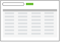
03. Search/ Results
The Search screen pattern can range from very simple to quite advanced. Ideal for creating an efficient user experience by allowing the user to navigate directly to an item or set of items meeting specific criteria.


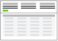
04. Filter Dataset
The Filter Dataset screen pattern can be vertical or horizontal. Ideal for creating an efficient user experience by allowing the user to refine a set of known data, or further refine search results.


05. Forms
All Form screens should be approached with a solid understanding of usability and design best practices. Refer to “Web Form Design: Filling in the Blanks” by Luke Wroblewski for reference.


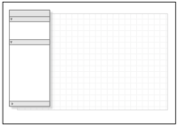
06. Palette/ Canvas
The Palette/ Canvas screen pattern is seldom the right pattern to apply, but it is the only pattern for documenting or creating: linear or non-liner processes; flow diagrams; screen layouts; design/diagram with physical size or layout constraints.


07. Dashboard
A well designed Dashboard will provide: key information at a glance, real time data, easy to read graphics, clear entry points for exploration This is typically not achieved by displaying a single screen of metrics (either in a big table, or just a bunch of graphs). Providing a high degree of customization is no substitute for user research and testing. Stephen Few has a nice book on this topic Information Dashboard Design: The Effective Visual Communication of Data .


08. Spreadsheet
The Spreadsheet screen pattern is ideal for creating an efficient user experience by allowing the user to easily scan, edit and enter information (in bulk). The Spreadsheet should provide the following functionality: standard table features like sort, hide/show columns, rearrange columns, group by (if applicable), global level undo/redo, add/insert/delete row, keyboard navigation, import and export.


09. Wizard
The Wizard/Quick Start screen pattern is ideal for creating an efficient user experience by guiding the user through a complex or infrequent workflow.


")

10. Question & Answer
The Q&A screen pattern is ideal for creating an efficient user experience by allowing the user to enter known information and receive a solution. Q & A differs from Search in that this pattern should be used to assist users in identifying possible options or a single recommendation in an arena they are lacking expertise (health insurance, mortgages, planning, purchases).


11. Parallel Panels
The Parallel Panels screen pattern can be stacked (showing one at a time) or unstacked (showing all at once). This pattern is ideal for organizing chunks of information that are similar or have interdependent tendencies. Efficiency is gained by keeping the user in one screen. Ideal candidates for the stacked variation of this pattern are simple work-flows with: a high level, visible goal that is fed by multiple inputs, multiple non-sequential steps. This combines a number of the web site patterns outlined in “Designing Interfaces” by Jennifer Tidwell for a single pattern for chunking and displaying data.


12. Interactive Model
The Interactive Model screen pattern is characterized by many interactive elements associated with the key object (a calendar, map, graph, chart, canvas). It is ideal for creating a user experience that is closely aligned with the user’s mental model (a natural fit). Excellent candidates for this pattern are: calendars, maps, gantt charts, what-if scenarios (including calculators), WYSIWYG editors (including photo editing).


Bonus. Blank State
This is the natural state of the application, before any data has been entered or accessed. The book, “Getting Real” by 37signals”explains that a blank state screen is an excellent place to set users expectations. By giving them a preview this can lower anxiety and reduce frustration and confusion. Items to include in a blank state screen include: videos, quick tutorials, help tips, a screenshot of what a fully loaded screen will look like.
Missing Patterns?
Noticeably absent are two patterns that are grossly overused and misused in enterprise software- portals and tabs.- Portals- If your market research, business requirements and user feedback lead you to design a portal, follow the same design principles and best practices as the Dashboard pattern.
- Tabs- Tabs are a component, and ultimately not a screen pattern. They are to alternate between views of data in the same context. If the data structure is leading you to a tab heavy UI design, I have two suggestions. First, reconsider the IA. Use card sorting and/or hire a professional Information Architect to help you for a few days. Second, follow the same design principles and best practices as the Parallel Panels pattern.
References
- The Design of Sites: Patterns for Creating Winning Web Sites (2nd edition).
- The Design of Sites: Patterns, Principles, and Processes for Crafting a Customer-Centered Web Experience
- “The Principles of Beautiful Web Design”. Jason Beaird.
- Designing Interfaces: Patterns for Effective Interaction Design
- Designing Web Navigation: Optimizing the User Experience
No comments:
Post a Comment